|
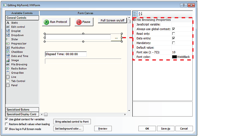
To create or edit forms, you must have VWorks Technician- or Administrator-level access. You should also have an understanding of how to create protocols and define JavaScript variables in the VWorks software.
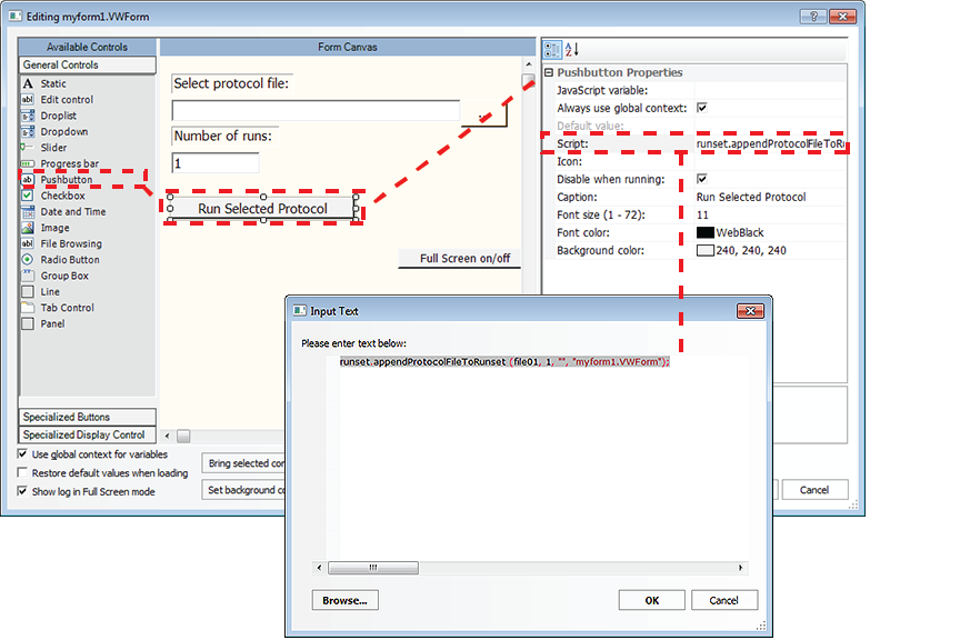
1 Under Available Controls, click General Controls, and then drag the desired control to the Form Canvas area.
2 In the Form Canvas area, click the control that you want to set up, so that a resizing box appears around the border. To resize the control, drag one of the sizing handles.
3 Edit the Properties for the control. The properties can include a combination of the following depending on the control:Note: If you want one control to overlap another control on the form, select the control that you want on top, and then click Bring selected control to front.
For example, if you want the form’s user to enter the aspirate volume for a given task, you could use an Edit control that has a JavaScript variable of vol. In the protocol, you would specify the Aspirate Properties for Volume as = vol. If the form’s Use global context for variables check box is selected, you can ignore this setting. If the form’s Use global context for variables check box is not selected, specify which context to use for the control’s JavaScript variable:
• Global context. Select this check box.IMPORTANT Any protocol that uses the global context and has JavaScript variables of the same name will be affected by changes you make to this variable, even if this form’s Use global context for variables check box is not selected.
• Context of the running protocol. Clear this check box.
• FixedSingle. Adds a single line that encloses the control.
• Fixed3D. Adds a 3-dimensional effect to the border’s appearance.
• Center. Center-aligns the image on the control.
• Stretch. Stretches the image to fit the size of the control. The dimensional ratio of the image is not maintained.
• Tile. Uses multiple copies of the image to cover the entire control area. The images are in their original sizes and are placed adjacent to one another.
• Zoom. Magnifies the image such that the width or length covers the width or length of the control. The dimensional ratio of the image is maintained.
• None. You can move the control freely on the canvas. Select None if you want to manually position the control, and you prefer to set the size of the control using the Width and Height properties.
• Top. The top side of the control is adjacent to the top of the Form Canvas. The control’s width is increased to match the width of the canvas. Although the width is fixed, you can change the Height value.
• Left. The left side of the control is adjacent to the left side of the Form Canvas. The control’s height is increased to match the height of the canvas. Although the height is fixed, you can change the Width value.
• Bottom. The bottom side of the control is adjacent to the bottom of the Form Canvas. The control’s width is increased to match the width of the canvas. Although the width is fixed, you can change the Height value.
• Right. The right side of the control is adjacent to the right side of the Form Canvas. The control’s height is increased to match the height of the canvas. Although the height is fixed, you can change the Width value.
• Fill. The control’s size is increased so that it completely covers the Form Canvas area. The width and height of the control are fixed.
The following figure shows an example of a Static text control with a display string that provides the label, Volume (uL) for an Edit control.
Figure. Dropdown Properties example
• Horizontal. The scale reads from left to right, Min value to Max value.
• Vertical. The scale reads from bottom to top, Min value to Max value.
Optional. To change the color, click the field, and then click thethat appears.
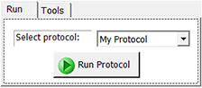
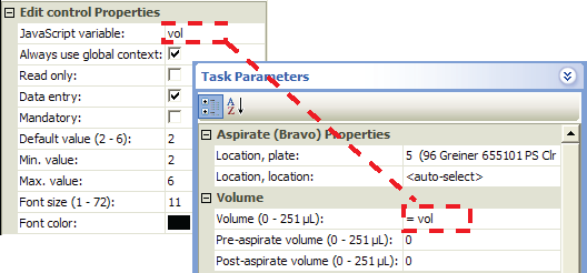
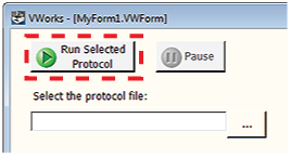
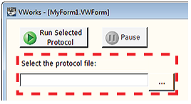
Figure. Workflow to create a pushbutton
In addition to the properties common to the general controls, the Pushbutton control has the following properties. For an example of how to set up a pushbutton using a script, see Example: Creating a scripted Pushbutton control in a form.
• Global context. Select the check box to use the global context. For example, if the button is to be pressed while no protocol is running, you must use the global context.IMPORTANT Any protocol that uses the global context and contains JavaScript variables of the same name will be affected by changes you make to this variable, even if this form’s Use global context for variables check box is not selected.
• Context of the running protocol. Clear the check box to use the protocol’s private context. Optional. To select an image to use as an icon in addition to the button caption, click the field, and then click thebutton that appears.
For an example of how to set up a File Browsing control, see Example: Creating a scripted Pushbutton control in a form.
For example, if you had a grouping of options for size, you could use the string, size, as the Group ID.
• Time. The user can edit the default values.
• Date. The user can click the drop-down list to select the date from a calendar.
• Normal. Each tab is sized to fit its name.
• Fixed. The longest tab name determines the size of all the tabs.
• FillToRight. The longest tab name determines the size of all the tabs, and the tabs are flush with the right and left margins of the control. IMPORTANT The Dock selection overrides the values you specify for the Width and Height properties. For example, if you dock the control at the top of the canvas, the software increases the width of the control and updates the Width value. To return to the previously set Width and Height values, set the Dock property to None. For more information about docking tabbed pages, see Setting properties common to the general controls.
The Panel control has properties that are common to the other general controls. See Setting properties common to the general controls.