Adding form controls that allow editing or runtime data display
About this topic
To create or edit forms, you must be an administrator or technician. You should also have an understanding of how to create protocols and define JavaScript variables in the VWorks software.
This topic describes the General Controls in the Form Designer window and how to configure them.
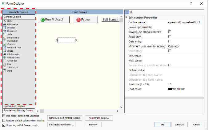
Figure General Controls in Form Designer window
 |
For more details on creating forms, see Workflow for creating or editing a form.
Overview of the General Controls
The controls available under General Controls can be assigned JavaScript variables to allow users to edit data or to display runtime data on the form. For example, you might want the form to display the volume dispensed or to allow the form’s user to enter the number of mix cycles. The JavaScript variable assigned to the control must also be assigned to the given task parameter value.
The general controls include the following:
Control | Description |
|---|---|
Static text | Displays read-only text. Use this control to create: • Captions for other controls on the form, such as drop-down lists, progress bars, sliders, and edit controls. • Read-only displays for runtime data. The JavaScript variable must be assigned in the Static control properties and in the corresponding task parameter in the protocol. The following figure shows an example that consists of two Static text controls in combination with a Slider control. A Static text control (left) provides the caption, Mix cycles, and a Static text control (right) displays the value of the current slider setting. 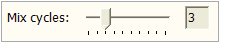 |
Edit control | Allows form users to enter or edit data. The JavaScript variable must be assigned in the Edit control properties and in the corresponding task parameter in the protocol. The following figure shows an Edit control (right) that allows the form users to edit the volume. This control has an assigned JavaScript variable (vol), which is also assigned in the corresponding task parameter in the protocol. 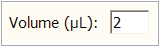 Note: A Static text control (left) provides the caption, Volume (uL). |
Droplist | Provides a drop-down list of choices for a task parameter. In the following figure the Droplist control has an assigned JavaScript variable (BCside) that is also specified in the protocol task parameter for defining the barcode side of the labware. 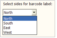 Note: A Static text control provides the caption for the Droplist control. |
Dropdown controls | Provides a drop-down list of choices and allows users to type arbitrary text into the edit field. The Dropdown control in the figure has an assigned JavaScript variable (time) that is also specified in the protocol task parameter for defining the incubation time. 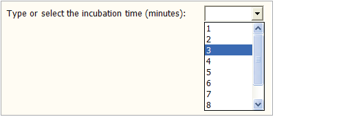 Note: A Static text control provides the caption for the Dropdown control. |
Slider | Enables users to set a value on a continuous range of possible values. The following figure shows a horizontal and vertical slider, where the position of the slider is coordinated with a Static text control (left) or Edit control (right). 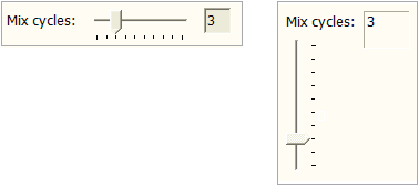 In the horizontal example (left), the user moves the slider to set the Mix task parameter value, while the value updates in the display. In the vertical example (right), the user can type a number in the box or move the slider to set the Mix task parameter value. |
Progress bar | Provides a visual indication of task progress. The JavaScript variable must be assigned in the control properties and in the corresponding task parameter in the protocol. In the following figure, the gray bar shows how much of the task has been completed. 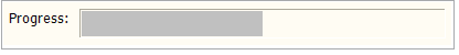 Note: A Static text control provides the caption, Progress. Note: To display the progress for the entire protocol or runset that the form is running, use the Overall Progress bar under Specialized Display Controls. |
Pushbutton | Allows you to write your own script for the action that the button will perform. The following figure shows a form with a custom pushbutton for running a protocol that the form’s user selects in a File Browsing control. The script specified in the Pushbutton Properties calls the file path defined as the JavaScript variable for the File Browsing control. 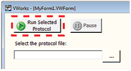 Note: For more details on how to set up this example, see Example: Creating a scripted Pushbutton control in a form. |
File Browsing | Allows users to select or save the specified file type. 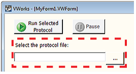 A Static text control provides the caption, Select the protocol file. |
Checkbox | Allows users to enable or disable the corresponding actions. The JavaScript variable must be assigned in the Checkbox control properties and in the corresponding task parameter in the protocol. The following figure shows two examples. 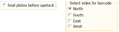 If the user selects the Checkbox properties, the assigned JavaScript variable is set to 1. If the user clears the check box, the assigned JavaScript variable is set to 0. |
Radio button | Presents choices from among several items. Each Radio button control has a JavaScript variable that is also assigned in the corresponding protocol task parameter. 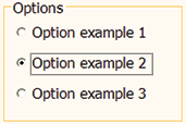 If a user selects an option, the assigned JavaScript variable is set to 1. If the user clears the option, the assigned JavaScript variable is set to 0. |
Date and Time | Displays a preset date and time or a date that the user can set. To correspond with a given task, the JavaScript variable must be assigned in the control properties and in the corresponding task parameter in the protocol. 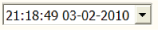 Note: You can use the Elapsed Time indicator for the entire run. See Adding indicators for elapsed time and progress to a form. |
Group box | Displays a rectangle that can be resized and labeled to visually group other controls together. To correspond with a given task, the JavaScript variable must be assigned in the control properties and in the corresponding task parameter in the protocol. |
Image | Allows you to place a static image on the form. To correspond with a given task, the JavaScript variable must be assigned in the control properties and in the corresponding task parameter in the protocol. |
Line | Provides a vertical or horizontal line that you can use to visually separate items on the form. |
Tab Control | Displays tabbed pages in the form. You can add different controls and information in each tabbed page. Figure Tabbed pages 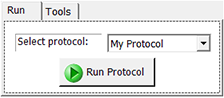 By default, when you drag a Tab Control onto the Form Canvas, the software displays two tabbed pages. To add another tabbed page, right-click the tab area, and select Add tab. To remove a tabbed page, right-click the tab, and then select Remove tab. To change the tab names, see Tab Control properties. Figure Adding or removing tabbed pages 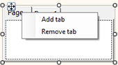 |
Panel | Displays a container in which you can add controls and information. You can add one or more panels in a form to group or categorize different controls. Figure Panel containing different controls 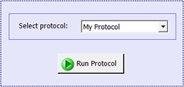 |
Configuring the General Controls
To add a control to the form:
1 Under Available Controls, click General Controls, and then drag the desired control to the Form Canvas area.
Note: To turn off the autogrid, press ALT while dragging the control into position.
2 In the Form Canvas area, click the control that you want to set up, so that a resizing box appears around the border. To resize the control, drag one of the sizing handles.
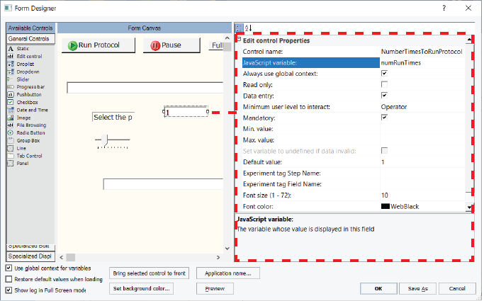
Note that the corresponding properties appear for the selected control as the following figure shows.
Figure Form Designer window displaying properties for the selected control
 |
Note: Click Preview to display the image that the form’s user will see.
3 Edit the Properties for the control. The properties can include a combination of the following depending on the control:
The Line control does have any properties that you can set.
Note: If you want one control to overlap another control on the form, select the control that you want on top, and then click Bring selected control to front.
Properties common to the general controls
The following table lists the properties for all controls. A given control might use only a subset of the properties listed.
Property | Description |
|---|---|
Control name | The descriptive name associated with the control. The Control name does not appear on the form. Use a functionally descriptive name so that references to this control are recognizable in the Main Log and in audit trail reports. For details, see About the naming of form controls. |
JavaScript variable | The JavaScript variable that will be associated with the focused control. Type any string that qualifies as valid syntax for a JavaScript variable name. In the protocol, type the variable name for the corresponding Task Parameters property. For example, if you want the form’s user to enter the aspirate volume for a given task, you could use an Edit control that has a JavaScript variable of vol. In the protocol, you would specify the Aspirate Properties for Volume as = vol.  For more details on using JavaScript variables in the Task Parameters area, see Using simple variables. |
Always use global context | If the form’s Use global context for variables check box is selected, you can ignore this setting. If the form’s Use global context for variables check box is not selected, specify which context to use for the control’s JavaScript variable: • Global context. Select this check box. For example, if the variable in question will be acted on before the protocol is running or is scheduled to run, use the global context.  Any protocol that uses the global context and has JavaScript variables of the same name will be affected by changes you make to this variable, even if this form’s Use global context for variables check box is not selected. Any protocol that uses the global context and has JavaScript variables of the same name will be affected by changes you make to this variable, even if this form’s Use global context for variables check box is not selected. • Context of the running protocol. Clear this check box. For example, if the variable in question will communicate with the protocol once the protocol is running or is scheduled to run, you may not need to use the global context. For more details on JavaScript context, see Understanding JavaScript context in form design. |
Read only | The state that determines whether the form's user can edit the contents of the control. • Select the check box to prevent users from editing the control contents. • Clear the check box to allow users to edit the control contents. |
BorderStyle | The border surrounding the control. You can specify one of the following border styles: • FixedSingle. Adds a single line that encloses the control. • Fixed3D. Adds a 3-dimensional effect to the border’s appearance. |
BackgroundImage | The image displayed as the background for the control. The selected image is displayed on top of the selected background color. Image files must be imported into the VWorks file storage system before they are available for use in the VWorks software. To import an image file, see Importing and exporting miscellaneous files. To use the image in the form, click the BackgroundImage field, and then click the  button that appears. button that appears.In the Open File dialog box, locate and select the image file (.jpg, .png, .bmp, or .ico), and then click Open. |
BackgroundImageLayout | How the selected image is displayed. Select one of the following display methods: • Center. Center-aligns the image on the control. • Stretch. Stretches the image to fit the size of the control. The dimensional ratio of the image is not maintained. • Tile. Uses multiple copies of the image to cover the entire control area. The images are in their original sizes and are placed adjacent to one another. • Zoom. Magnifies the image such that the width or length covers the width or length of the control. The dimensional ratio of the image is maintained. |
Background_Color | The color of the control. Click the field, and then select the desired color. |
Data entry | The option to allow the user to edit the value in the control when the protocol is paused. • Select the check box to allow form users to edit the value when a protocol is not running and when a running protocol is paused. • Clear the check box to allow users to edit the value only when a protocol is not running. For the data entry controls, you can also provide the Print, Reset, and Save data entry buttons from the Specialized Buttons area. For details, see Overview of the specialized buttons. Note: The Data entry property is not available if the Read only check box is selected. |
Allow data entry when paused | The option to allow the control to be editable while a running protocol is associated with the form. • Select the check box (true) to allow the control to be editable while a running protocol is associated with the form. This parameter defaults to true when the control is created, or when opening a form in the Form Editor that was created in a version earlier than VWorks 14.1.1. • Clear the check box if you want the control to be editable only when the protocol associated with the form is not running. |
Minimum user level to interact | The VWorks access level required for this form control. The options are Operator (default), Technician, or Administrator. |
Mandatory | The option to require the form user to enter a value for this field before starting the associated protocol or runset. Select the check box to require the user to enter a value for the field. Clear the check box if the user can start the protocol or runset without entering a value for the field. Available if the Data entry check box is selected. |
Default value | The value the form should display when the user resets the field. Type the default value in the box. Special conditions apply for some controls, such as check boxes and radio buttons. For details, see the property description for the specific control. |
Min value, Max value | A range of permitted values. The value saved to the associated JavaScript variable will be a number. Type the minimum and maximum value to define the range of values. If the form’s user types a value outside this range, an error message appears. To allow the user to type any value in an Edit control, leave the Min and Max value properties blank. The value saved to the associated JavaScript variable will be a number, unless the value appears to be something other than a number. In which case, the value will be saved as a string. Special conditions apply for some controls, such as sliders. For details, see the property description for the specific control. |
Experiment tag Step Name | Experiments database only. Specifies the name used to create an experiment tag (Step Name) in the Experiments database for the form control when a protocol is run using this form. For details, see Configuring a form for experiment IDs and Experiments database. Note: The Experiment tag Step Name property is available only if the Data entry check box is selected. |
Experiment tag Field Name | Experiments database only. Specifies the name to be used for the corresponding experiment tag in the Experiments database when a protocol is run using this form. For details, see Adding form controls that allow editing or runtime data display. Note: The Experiment tag Field Name property is available only if the Data entry check box is selected. |
Order in Report | Experiments database only. Specifies the order in which the associated data tags for this control appear in an experiments report relative to other controls in the same step. For details on creating forms to track experiment data, see Configuring a form for experiment IDs and Experiments database. |
Dock | The option to anchor the control to a position on the Form Canvas. Select one of the following positions: • None. You can move the control freely on the canvas. Select None if you want to manually position the control, and you prefer to set the size of the control using the Width and Height properties. • Top. The top side of the control is adjacent to the top of the Form Canvas. The control’s width is increased to match the width of the canvas. Although the width is fixed, you can change the Height value. • Left. The left side of the control is adjacent to the left side of the Form Canvas. The control’s height is increased to match the height of the canvas. Although the height is fixed, you can change the Width value. • Bottom. The bottom side of the control is adjacent to the bottom of the Form Canvas. The control’s width is increased to match the width of the canvas. Although the width is fixed, you can change the Height value. • Right. The right side of the control is adjacent to the right side of the Form Canvas. The control’s height is increased to match the height of the canvas. Although the height is fixed, you can change the Width value. • Fill. The control’s size is increased so that it completely covers the Form Canvas area. The width and height of the control are fixed. |
Font size | The font size of the text that appears in the control. To change the font size, type a new number in the field. Any controls that you create subsequently will use the new font size. Default: 10 |
Font color | The color of the text that appears in the control. To change the color for the selected control and subsequently created controls, click the field, and then click the  that appears. that appears.Click the color in the palette list, or click Custom Color to open the Select Color dialog box and create a custom color. Default font color: Web Black Default background color: 240, 240, 240 |
Static text control properties
The Static text control has the following properties in addition to the properties common to the other general controls.
Property | Description |
|---|---|
Display string | Type the text that you want to appear on the form, for example, a caption for another control on your form. The following figure shows an example of a Static text control with a display string that provides the label, Volume (uL) for an Edit control. Note: Display string is enabled only if the JavaScript variable property is blank. Note: To use the symbol µ, copy the characters to the Microsoft Clipboard from other software. Right-click the field and choose Paste to insert the character into the field. |
Border | To add a border around the control, ensure the check box is selected (default). For example, a border is useful if you want to provide a display of runtime data. To remove the border, clear the check box. For example, if you are creating a caption for one of the other controls, a border is unnecessary. The following figure shows an example of two Static text controls combined with a Slider control. The caption on the left is a Static control with no border. The display on the right is a Static control with a border. |
To coordinate the Static text control with a protocol task parameter, both the control and the task parameter must use the same JavaScript variable.
To coordinate the Static text control with another control, for example, the slider, both controls must have the same assigned JavaScript variable and both controls must specify the global JavaScript context so that they can communicate with each other.
Edit control properties
The Edit control has the following property in addition to the properties common to the other general controls.
Property | Description |
|---|---|
Set variable to undefined if data invalid | The option to automatically assign a JavaScript value as undefined in a case where a variable that requires a numeric value has been declared, but it has not been assigned a numeric value. • If you select this option and the corresponding field requires a numeric value, but the field is left blank or contains a string instead of a number, the software executes the following internal script: var <variable_name> = undefined; Protocol scripts can test for this undefined value and act accordingly. • If you do not select this option and you have a variable that requires a numeric value, the control can yield an unexpected result if a valid numeric value is missing. For example, suppose you specified the following properties for an Edit control: – Data entry: checked – Mandatory: unchecked – JavaScript variable: vol – Always use global context: checked – Min value: 1, Max value: 251 If the form user enters a value of 55 for the vol variable and then runs the associated protocol, the software executes the following internal script: var vol = 55; But suppose that for a subsequent run, the user leaves this field on the form blank. This time the software executes the internal script: var vol; This script ensures that the variable exists but does not assign a value to it. If the global context is not cleared in this case, the scripts in the protocol will behave as though the user entered 55 on the form, even if this was not the intended value. |
Always treat as string | Select the check box if you want to ensure that a value will always be treated as a string, even if it looks like a number. Clear the check box if you want the software to treat the entered text as a number if it looks like a number, and treat it as a string if it does not look like a number. |
Droplist and Dropdown properties
The Droplist and Dropdown controls have the following properties in addition to the properties common to the other general controls.
Note: You might want to use these controls in combination with a Static text control to display a caption for your drop-down list or drop-down combo box.
Property | Description |
|---|---|
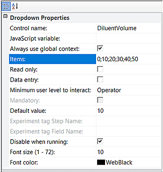
Items | Type the list of items that will appear in the list of the Droplist or Dropdown control, where each item is separated by a semicolon with no spaces. For example, type 3;6;9;12 to provide the form’s user with the choices 3, 6, 9, 12. |
Default value | Type the item from Items list that will display in the form by default. Make sure that the default value is also in the Items list. Otherwise, the Droplist control will display the first list item by default. The Dropdown control will display the default value even if the value is not included in the Items list. |
Disable when running | Select the check box to prevent the operator from changing the selected Dropdown item while the protocol is running. Clear the check box to enable the operator to change the selected Dropdown item during the protocol run time. This property is available only when the Read only check box is cleared. If the Read only property is selected, the Disable when running property is not available. |
Figure Dropdown Properties example
 |
Slider properties
The Slider control has the following properties in addition to the properties common to the other general controls.
Property | Description |
|---|---|
Orientation | Click the field to display the and then click one of the following:• Horizontal. The scale reads from left to right, Min value to Max value. • Vertical. The scale reads from bottom to top, Min value to Max value. The figure shows an example of a horizontal and vertical slider. The horizontal slider is combined with an Edit control that displays the changing numeric value as the slider is moved. 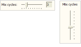 |
Min value, Max value | To specify the range of values that the slider represents, type a minimum and maximum numeric value. The slider has a tick mark for each numeric value in the range. For example, a slider with a range of 1–10 has 10 tick marks, and a slider with a range of 1–20 has 20 tick marks. 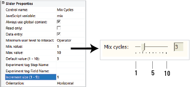 When the form’s user moves the slider, the resulting value is written to the control's JavaScript variable as soon as the slider is released. |
Increment size | Type a positive number to use as the increment that the numeric value changes as the slider is moved. For example, if the slider’s range is 1–10 and the increment size is 1, the value will change by 1 each time you move the slider. If the increment is 2, the value will change by 2 each time you move the slider. The increment size should be in relation to the slider’s range of values. For example, a slider that has a narrow range of values typically would not have a large increment size. Likewise, a small increment size may be insufficient for a slider that has a very wide range of values. |
You can use the Slider control in combination with the:
• Static text control to display a caption for the slider or display the current value of the slider’s setting.
• Edit control to display the current value of the slider’s setting or allow users to enter a value instead of using the slider.
To coordinate the slider setting with a Static text control or Edit control and the protocol task parameter setting:
• Both the Slider and Static or Edit controls must have the same JavaScript variable assigned (for example, mix).
• The variable assigned in the Slider and Static or Edit controls must be in the global context so that the two controls can communicate.
• The corresponding Mix task parameter in the protocol must also have the same JavaScript variable assigned (for example, mix).
If the slider’s Data Entry property is not selected, the slider will move according to the current value of the underlying JavaScript variable. The behavior of the slider is undefined if the JavaScript variable does not have a numeric value, or if the variable’s value is outside the slider's range.
Progress bar properties
The Progress bar control has the following properties in addition to the properties common to the other general controls.
Note: You might want to use this control in combination with a Static text control to create the progress bar caption.
Property | Description |
|---|---|
JavaScript variable | Must have a numeric value that is a positive number and the value must not be greater than the Max value setting. |
Max value | Type a numeric value larger than 0. The value represented by the left end of the progress bar is always 0. The Max value determines the value represented by the right end of the progress bar. |
Bar color | Optional. To change the color, click the field, and then click the that appears.Click the color in the palette list, or click Custom Color to open the Select Color dialog box and create a custom color. 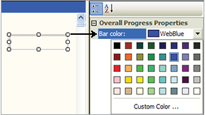 |
The progress bar moves according to the current value of the underlying JavaScript variable. All progress bars are horizontal.
Pushbutton control properties
The Pushbutton control can execute any JavaScript code that you specify. You provide the script in the Pushbutton Properties, as the following figure shows.
Figure Workflow to create a pushbutton
 |
In addition to the properties common to the general controls, the Pushbutton control has the following properties. For an example of how to set up a pushbutton using a script, see Example: Creating a scripted Pushbutton control in a form.
Property | Description |
|---|---|
JavaScript variable | The JavaScript variable that will be associated with the control. Type any string that qualifies as valid syntax for a JavaScript variable name. The JavaScript variable can be used to exchange a result or value between the protocol and the form. A variable can also be shared between different areas of the same form, for example, to update another field within a form with a button. If you provide a variable, you can specify the Default value for the JavaScript variable. |
Always use global context | Specify the context in which to execute the script: • Global context. Select the check box to use the global context. For example, if the button is to be pressed while no protocol is running, you must use the global context. Any protocol that uses the global context and contains JavaScript variables of the same name will be affected by changes you make to this variable, even if this form’s Use global context for variables check box is not selected.• Context of the running protocol. Clear the check box to use the protocol’s private context. |
Default value | Specify the default value of the JavaScript variable. |
Script | Click the field, and then click the button that appears. In the Input Text dialog box, type the JavaScript code to be executed when the pushbutton is pressed, or click Browse to select the file (.txt) that contains the script.Note: If the script specifies a file on your computer, and you later export the form with this pushbutton, you must specify the file in the Additional Files page of the Export Wizard. |
Icon | Optional. You may select an image to use as an icon. Image files must be imported into the VWorks file storage system before they are available for use in the VWorks software. To import an image file, see Importing and exporting miscellaneous files. To use the image in the form, click the Icon field, and then click the button that appears.In the Open File dialog box, locate and select the image file (.jpg, .png, .bmp, or .ico), and then click Open. |
Disable when running | To make the button unavailable (grayed) whenever the form is running a protocol or runset, select this check box (default). To make the button enabled at all times, clear this check box. |
Caption | To change the label that appears on the button, type the new text in the field. |
File browsing control and File Browse button properties
The Form Designer window includes the following file browsing controls under Available Controls:
• File Browsing control (General Controls). Enables the form’s user to select or save a file at a specified location and displays the selected file name.
 |
• File Browse button (Specialized Buttons). Enables the form’s user to select or save a file at a specified location, but it does not include a file name display.
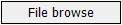 |
Figure Properties for the File Browsing control (left) and the File Browse button (right)
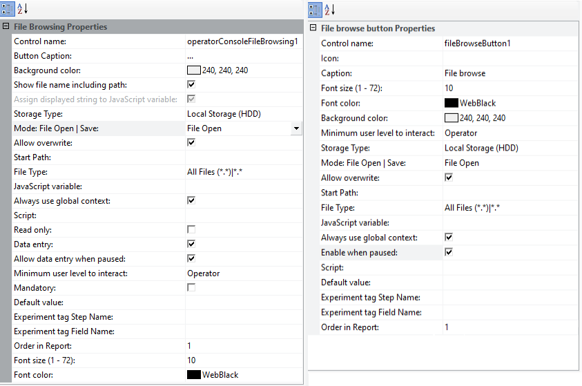 |
The File Browsing control and File Browse button have the following properties in common:
Property | Description |
|---|---|
Control name | See Properties common to the general controls for a description. |
Storage Type | The type of Shared Services storage. The options are: • Shared Services Repository — Content Management • Local Storage (HDD) — local file system |
Mode: File Open | Save | The type of dialog box to open. The options are: • File Open • File Save As |
Allow overwrite | Shared Services Repository storage only. Specifies whether to allow overwriting of a file that already exists in Content Management: • Select the check box to allow overwriting. • Clear the check box to prevent overwriting. |
Start Path | The file path to display in the File Open or File Save As dialog box, for example, /VWorks Projects/VWorks/AM Methods. |
File Type | The filter to use for the available types of files, for example, text (*.txt) or (*.csv), Excel (*.xlsx) or (*.xls), method files (*.mth), and so forth. |
Script | The JavaScript that this File Browse button or File Browsing control will execute. The script will run after the form’s user presses the button, selects or enters a file name, and then clicks OK. The JavaScript variable’s value will hold the selected full path file name. To enter the script that this button will run: 1 Click the field, and then click the button that appears.2 In the Input Text dialog box, type the JavaScript code in the box. Alternatively, click Browse. In the Open File dialog box, select a file that contains the JavaScript code, and then click Open. Click OK to close the Input Text dialog box. |
JavaScript Variable | The JavaScript variable that will be associated with the control. Type any string that qualifies as valid syntax for a JavaScript variable name. The JavaScript variable can be used to exchange a result or value between the protocol and the form. A variable can also be shared between different areas of the same form, for example, to update another field within a form with a button. If you provide a variable, you can specify the Default value for the JavaScript variable. |
Default value | Specify the default value of the JavaScript variable. |
Always use global context | Specify the context in which to execute the script: • Global context. Select the check box to use the global context. For example, if the button is to be pressed while no protocol is running, you must use the global context. Any protocol that uses the global context and contains JavaScript variables of the same name will be affected by changes you make to this variable, even if this form’s Use global context for variables check box is not selected.• Context of the running protocol. Clear the check box to use the protocol’s private context. |
Minimum user level to interact | See Properties common to the general controls for a description. |
Background color, Font size, Font color | See Properties common to the general controls for a description. |
Experiment tag Step Name | Experiments database only. Specifies the name used to create an experiment tag (Step Name) in the Experiments database for the form control when a protocol is run using this form. For details, see Configuring a form for experiment IDs and Experiments database. Note: The Experiment tag Step Name property is available only if the Data entry check box is selected. |
Experiment tag Field Name | Experiments database only. Specifies the name to be used for the corresponding experiment tag in the Experiments database when a protocol is run using this form. For details, see Adding form controls that allow editing or runtime data display. Note: The Experiment tag Field Name property is available only if the Data entry check box is selected. |
Order in Report | Experiments database only. Specifies the order in which the associated data tags for this control appear in an experiments report relative to other controls in the same step. For details on creating forms to track experiment data, see Configuring a form for experiment IDs and Experiments database. |
Additional File Browsing control properties
The File Browsing control has the following additional properties.
Property | Description |
|---|---|
Button Caption | The text that appears on the control’s button. You can use the default (…) or type a custom label. |
Show file name including path | The option to show the full file path or only the file name. • Select the check box to display the selected file name including path. • Clear the check box to display only the selected file name. |
Assign displayed string to JavaScript variable | Selecting the check box (default) will populate the JavaScript variable with whatever is displayed in the File Browsing control. If the Show file name including path check box is selected, then the full path will be displayed. If the Show file name including path check box is not selected, then the file name will be displayed without the path. Clearing the check box will populate the JavaScript variable with the full file path regardless of whether the Show file name including path is selected or not. Note: This parameter enable protocols made in previous versions of software to get access to the full path in the file browser control, even if Show file name including path is unchecked. |
Read only, Data entry, Mandatory | See Properties common to the general controls for a description. |
For an example of how to set up a File Browsing control, see Example: Creating a scripted Pushbutton control in a form.
Additional File Browse button properties
The File Browse button has the following additional properties.
Property | Description |
|---|---|
Icon | Optional. You may select an image to use as an icon in addition to the button caption. Image files must be imported into the VWorks file storage system before they are available for use in the VWorks software. To use an image in the form: 1 If the image file is not yet in the VWorks file storage, import the image file. See Importing and exporting miscellaneous files. 2 Click the Icon field, and then click the button that appears.3 In the Open File dialog box, locate and select the image file (.jpg, .png, .bmp, or .ico), and then click Open. |
Caption | To change the label that appears on the button, type the new text in the field. |
Enable when paused | • Select the check box if you want the button to be enabled while a running protocol is associated with the form. This parameter defaults to true (check box selected) when the control is created, or when opening a form in the Form Editor that was created in a version earlier than VWorks 14.1.1. • Clear the check box to disable the button while a running protocol is associated with the form, even if the protocol is paused. |
Checkbox properties
The Checkbox control has the following properties in addition to the properties common to the general controls.
 |
Property | Description |
|---|---|
Caption | Type the string to be displayed to the right of the check box. |
Default value | Type one of the following: 0 — indicates the check box is cleared by default 1 — indicates the check box is selected by default Note: Any value other than zero indicates that the check box is selected. |
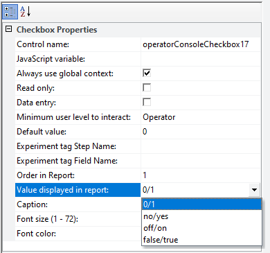
Value displayed in report | Experiment ID reports only. The value that appears in the experiment ID report when the corresponding check box on the form is cleared or selected for a protocol run. For details on setting up a form to work with the Experiments database, see Configuring a form for experiment IDs and Experiments database. Select one of the following options: • 0/1 • no/yes • off/on • false/true |
The Checkbox control is binary. When the check box on the form is selected, a 1 is written to the associated JavaScript variable. When the check box is cleared (unchecked), a 0 is written to the associated JavaScript variable.
Radio Button properties
The Radio Button control has the following properties in addition to the properties common to the other general controls.
Property | Description |
|---|---|
Default value | Type one of the following: 0 — indicates the option is cleared by default 1 — indicates the option is selected by default Note: Any value other than zero indicates that the check box is selected. |
Caption | Type the string to be displayed to the right of the radio button. |
Group ID | Type a string to use as the ID of the radio button group. Only one button in the group can be selected at a time. When the form's user selects a button in the group, all other radio buttons with the same Group ID are cleared (not selected) automatically. For example, if you had a grouping of options for size, you could use the string, size, as the Group ID. 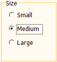 Note: You can use a Group box to visually group a collection of radio button options. |
The Radio Button control is binary. When the button on the form is selected, a 1 is written to the associated JavaScript variable. When the button is cleared, a 0 is written to the associated JavaScript variable.
Note: If the JavaScript variable's numeric value is anything other than 0, the option will display as selected.
Image (static) control properties
The Image control has the following properties in addition to the properties common to the other general controls.
Property | Description |
|---|---|
Image file | Image files must be imported into the VWorks file storage system before they are available for use in the VWorks software. To import an image file, see Importing and exporting miscellaneous files. To use the image in the form, click the Image file field, and then click the button that appears.In the Open File dialog box, locate and select the image file (.jpg, .png, .bmp, or .ico), and then click Open. |
Date and Time properties
The Date and Time control has the properties common to the other general controls. However, if you provide a default value, it must be in the following format. If you do not provide a default value, the software uses the current date and time from the computer.
Property | Description |
|---|---|
Default value | nn:nn:nn nn-nn-nnnn where, nn:nn:nn is the hour:minutes:seconds in a 24-hour clock and nn-nn-nnnn is the month:day:year |
If you select the Data entry property for this control, the user can enter:
• Time. The user can edit the default values.
• Date. The user can click the drop-down list to select the date from a calendar.
Group Box properties
The Group Box control has the following properties in addition to the properties common to the other general controls.
Property | Description |
|---|---|
Group name | Type the string to display as the caption for the group box. |
Controls that you drag inside the group box become part of the group box. The group box may need to be resized to ensure that all the controls within the group box borders are clearly visible.
Tab Control properties
The Tab Control has the following properties in addition to the properties common to the other general controls.
Tab Control property | Description |
|---|---|
Alignment | Specifies the position of the tabs: Top, Left, Right, or Bottom. |
SizeMode | Specifies the tab size: • Normal. Each tab is sized to fit its name. • Fixed. The longest tab name determines the size of all the tabs. • FillToRight. The longest tab name determines the size of all the tabs, and the tabs are flush with the right and left margins of the control. |
Width | Specifies the width of the tab control. |
Height | Specifies the height of the tab control. |
The Dock selection overrides the values you specify for the Width and Height properties. For example, if you dock the control at the top of the canvas, the software increases the width of the control and updates the Width value. To return to the previously set Width and Height values, set the Dock property to None. For more information about docking tabbed pages, see Properties common to the general controls.Each tabbed page contains the following properties in addition to the properties common to the other general controls.
Tabbed page property | Description |
|---|---|
Name | The text that is displayed on the tab. Provide a name that describes the function of the tab contents. |
Panel properties
The Panel control has properties that are common to the other general controls. See Properties common to the general controls.
Related information
For information about... | See... |
|---|---|
Workflow for creating or editing a form | |
Pushbutton and File Browsing controls | |
Controls under Specialized Buttons in the Form Designer window | |
Controls under Specialized Display Controls in the Form Designer window | |
Form properties in the Form Designer window | |
JavaScript context and form design | |
Creating a basic protocol | |
Using JavaScript |